Paul Rand Exhibition
Typography, Poster, Booklet Design
2017
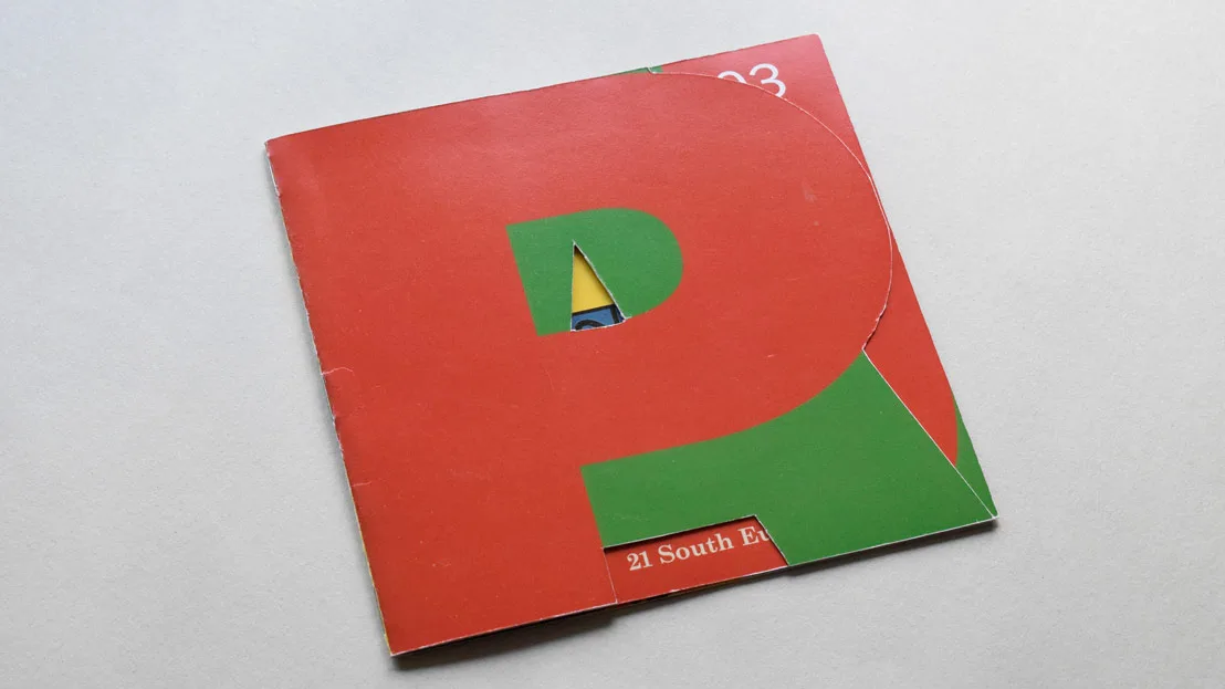
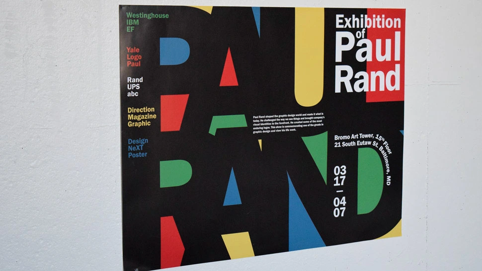
Creating a poster advertising an exhibition of a notable typography designer, Paul Rand, and a booklet for their show. Rand's primary colors and heavy use of sans-serif is used to strengthen the connection to his exhibition. Using different type sizes, to increase viewing distance and give different textures as a viewer approaches. Designing the 8 page booklet using each letter of his name as a page shape, Rand’s innovation was applied by cutting out the uncovered areas on each page giving each page a unique shape.
< Gallery
Exihibtion Booklet
5.5"x5.5"
